HOME | ABOUT US | MEDIA KIT | CONTACT US | INQUIRE
HOME | ABOUT US | MEDIA KIT | CONTACT US | INQUIRE
FOCUSED ON GIVING WORKERS SPACE THEY NEED TO EXCEL, INNOVATIVE COMPANIES ARE REMAKING OFFICES TO FIT THEIR UNIQUE MISSIONS.
Something profound is unfolding at workplaces across the country and around the world. And for good reason: Older Millennials have been voting with their resumes for the past decade, elevating workplace design considerations on their own hierarchy of career needs, and employers that don’t measure up find themselves continually posting help-wanted ads. In many cases, cubicle farms have been plowed under for much of the past decade, giving rise to more open, engag-ing workspaces with options that compel more movement throughout the day, promote more interaction with co-workers, help employees in their prime child-rearing years balance work and family, or help the singles among them balance work and their interests outside the office. Those spaces are greener. They have better lighting. At larger companies, on-site restaurants have replaced armies of vending-machine sentinels. It’s vitally important, say human resources executives and workplace designers, for smaller business owners to understand what’s about to happen in their work spaces. It’s well-known that Millennials are now the largest single demographic cohort in the work force. Less appreciated is that the trend is going to continue: the youngest of them are, in general, high school seniors today, so more than 20 percent of that generation’s members are yet to enter the full-time work force.
But there’s far more to nailing workplace design than grasping for trendy ideas. If you want to engage a work force and infuse a sense of mission and purpose, a workplace should be a physical manifestation of the corporate narrative, design professionals say. “Almost everybody we work with who has their own mission statement, knows their elevator speech, but when you get into a room that will manifest into built space, then you can have have real conversations about what that is, because everybody’s interpretation is a little different,” says Tucker Trotter, CEO of Dimensional Innovations. His Overland Park company is a national leader in high-design storytelling and branding of physical spaces for companies, universities and public facilities.
“When it comes to workplace environment, culture is really important,” he said. “If we can provide signage, graphics and the digital technology that helps tell that cultural story, the company story, it helps employees understand why they are there; you could argue that it makes you more efficient. Our goal, at the end of day, is we want your place to be beautiful, but we also want to create real business results—otherwise, we haven’t done our job.”
As you look around at new office construction and workplace rehab projects, some common themes are emerging, but some stark differences are, as well, depending on the type of work being done at a company. One that has global operations, for example, will have different needs for employees working non-traditional shifts. What’s cool and trendy in a financial-services setting might not fly in blue-collar settings. So some interesting customization is taking place.
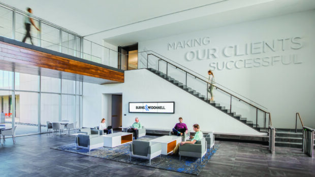
Take Burns & McDonnell. The design and construction giant completed the $74 million, 310,000-square-foot expansion of its global headquarters expansion by leaving little out when it comes to amenities. Already considered a career destination for qualities like employee ownership, company-paid health insurance covering nearly 80 percent of premiums (insurance that starts with part-timers pulling at least 30 hours a week) it incorporates an on-site pharmacy, a 20,000-square-foot MacKids Learning Academy, a day care for employees with preschoolers, expanded credit union, coffee bar with barista, adjustable desks, electric charging stations in the park-ing garage, and an expansive cafeteria with fresh menu items prepared daily and more. It was a classic example of drawing on employee desires and talents—the design and construction was all done in-house. The goal for many such employers is changing the concept of a workplace from just that—a place to work—and making it more of the place to be. That’s especially the case when collaborative work arrangements that are becoming more popular also contribute to employees socializing as groups.
Spring Venture Group, which has plans to hire 1,000 workers over the next few years and put them in its new Downtown headquarters, has already unveiled the first spaces for workers at 12 Wyandotte Plaza, remodeled by Rau Construction. Packed with amenities across the seven stories (and 130,000 square feet), it infuses vibrant color schemes and open spaces envisioned by the design firm Clockwork into an otherwise drab Downtown setting.
A lot of attention is being paid to the concept of shared workspaces, relaxation areas and even some recreational space. While that is going on inside the businesses, developers on the outside are focused on creating more venues for those innovative employers, especially along the lines of public transportation, with access to restaurants, nightspots and entertainment venues as well as schools, pharmacies and dry cleaners.
Some high-visibility examples of that are the development of Corrigan Station by Copaken Brooks in the Crossroads area, the largest Downtown office project in roughly 25 years. It filled quickly after opening in 2016, and is home to insurance brokerage Holmes Murphy & Associates, Hollis + Miller Architects, co-working space WeWork, and payment-solutions provider CardConnect.
With the streetcar line running adjacent to the 10-story property, employees from those companies enjoy open floor plans, natural lighting, 11-foot ceilings and an adjacent parking garage, and on-site caffeine fix from one of The Roasterie’s locations.
At Sandbox, the River Market advertising and marketing agency, core values underpinned the design, say managing partners Ethan Whitehill and Chad Smith. “We have a central value, the idea of collaboration,” Whitehill says. “First and foremost, the space had to be collaborative; that guides the actions of the company. The objective was to make Sandbox a haven of collaboration for difference makers, so we zeroed in on ‘haven.’” Still, he said the Three P’s of workspace had to be factored into the work done by Centric Projectgs and Crawford Architects: Privacy, permission and proximity. “Collaboration is a great goal,” he said, “but at the same time, there are open and private collaborations where people at times need to separate themselves.” The second and third floors of the building have, essentially, separate missions, and the spaces reflect that, with one clearly a place where the heavy creative lifting is done, and the other with more of hotel lobby feel, with a sprawling and well-appointed coffee bar at its core, inviting more meaningful conversations than you’d get a water cooler. Today, these types of workplaces are at the front edge of employment trends, workplace experts say. But their status as outliers will be short-lived—before long, such work environments will be table stakes in a continuing battle to attract top talent, and keep those employees in place.
Company: Dairy Farmers of America
Industry: Dairy production, distribution
Employees: About 400 at KC HQ
Scope of Work: New 110,000-square-foot HQ
Location: KCK
Project Cost: $30 million
Design Firms: HOK, Dimensional Innovations
General Contractor: JE Dunn Construction
Don’t let the button-down exterior of the building fool you: The second you lay eyes on a 29-foot sculpture of a milk pour in the lobby at Dairy Farmers of America, you know you’re in a workplace that stands apart from traditional office design. And the credit, says DFA’s chief of staff, Monica Massey, belongs to the cooperative’s project partners, HOK, Dimensional Innovations, J.E. Dunn Construction and VanTrust Development, because, she says, “these local companies worked together to achieve a vision I’m not sure we’d have had on our own.”
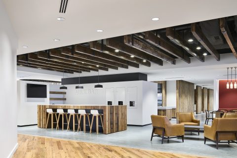
HOK, Dairy Farmers of America, Kansas City KS
The lobby sculpture sets the tone for the branding theme that flows throughout the building, which opened last year. Walls embedded with themes of milk bottles, ice cream scoops, cheese graters and other visual cues constantly reinforce the Story of Milk, a sense of mission and purpose for workers and visitors. The reasons? “First, to attract and retain the best talent, companies have to offer superior work environments, technology, support and amenities,” Massey said. Nearly 400 employees, she said, “spend lot of time in this space. Second, we wanted a space that also reflects the core of our business, farmer ownership,” something reinforced with wood paneling sourced from dairy barns. “It was an emphasis on ‘farm-to-fork.’
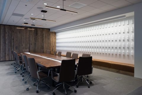
From the C-suite view, she likened the process — from concept to execution — to buying a car. “Sometimes you want a Cadillac, not a Yugo, and you end up in the middle. For example, we had no idea when we started how many shades of clear glass there were. We make a decision as a group, but then talk about functionality, UV rays, price, ‘we want this, but please find us something comparable that is cheaper.’ It was like that through the entire project. We kept adjusting where to put money, focusing on places and spaces employees really value.” Her advice to anyone with a major remodel in mind: “Find the team that aligns with your values and shares your vision; they’ll help execute it successfully.”
Company: Crestwood Equity Partners
Industry: Financial Services-Energy
Employees: 152
Scope of Work: 30,000-square-foot regional HQ
Location: Crown Center, KCMO
Design Firm: Hufft
Contractor: Hufft
In a new building, workplace design starts with a blank canvas. Remak-ing existing space? Rip and renew. But what about creating a smaller footprint? Will Moore can tell you. He heads the Kansas City office for Houston-based Crestwood Equity Partners, the energy-trading firm that relocated from its Country Club Plaza digs over to Crown Center. Because it was a square-footage re-duction, he said, the goal ”was to make the most efficient use of less space, while at the same time, creating more collaborative spaces for our employees.” That’s where the business model dictated. “Since our business is a fully-integrated service model, it is important to have employees in constant communication with each other,” he said. A trade floor that allows respective groups to be aligned and communicating lets them do that, and see what’s happening in the physical and financial markets to execute the business plan. “The trade floor accomplishes this with the availability of real-time data and employees in close proximity to one another,” Moore says. In addition, Dimensional Innovations helped drive the brand with creative tables that replicate a shale-oil play, and the office is decorated with pieces from the extensive art collection of former office manager Bill Gautreaux.
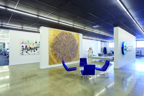
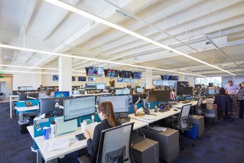
For visitors and workers alike, the office oozes the feel of a dynamic organization. “This begins with our logo in the lobby and continues through the gallery space, onto the trade floor,” Moore says. “The design of the office conveys the sophistication and creativity needed to provide top-tier customer service.” Moore’s advice to others: “Be prepared for the unexpected! For us, we had been located in the same office space for 14 years, and our employees had grown accustomed to that space.” So listening to employee concerns was a priority, understanding that not all could be addressed. “But our goal was to utilize as much input as we could,” Moore said. “Change can be hard, but it’s necessary for a company to evolve successfully. As with most projects, there were a
few ‘extras’ included in our initial budget, but overall, our goal of decreasing unusable square footage and making the working environment easier on our employees has resulted in overall savings and satisfaction.”
Company: Pro Athlete
Industry: eCommerce, sporting goods
Employees: 54
Scope of Work: Ongoing updates of 55,000-square-foot building for office space
Location: North Kansas City, MO
Design Firm: Dimensional Innovations
Contractor: Miller Stauch Construction
Unless you’re willing to tear up the office makeover playbook, you will not keep up with the constantly evolving workplace at Pro Athlete, the ecommerce retailer of baseball bats and gloves. “We’re a company that drives CFOs crazy because we don’t do budgets very well,” cracks Andrew Dowis, chief operating officer. “We don’t ask what the capital outlay is this year for facility improvements; we take one thing at a time, and maybe we say that’s too much right now, because we’ve got this other thing on its heels.”
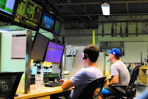
Unconventional? Perhaps. But there’s no doubt one of the region’s most appealing work spaces belongs to a company that shuns workplace norms. From the on-staff chef preparing made-to-order breakfast and lunch in a full commercial kitchen, to swimming pool, spa, haircut station, in-house sports bar—even the bank of TVs broadcasting games as customer service reps work the phones—it all comes down to creating an environment where the people connecting with consumers are both equipped to do their jobs, and are part of an experience those customers
can perceive. “We believe this is the way to do business,” says Dowis. “It’s not the way everybody does it, just the way we do it. We want a fun work environment where people love being here and it doesn’t feel like work. To do that, you have to invest in different things.”
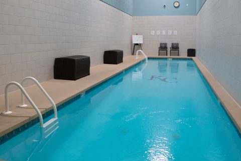
What sets this place apart for its 54 employees is that what you see today was not part of a grand master plan; it was done piecemeal, over the 12 years since the 30,000-square-foot building was acquired and expanded to 55,000, one cool project at a time. “We’re going to keep adapting. What we worry about with a master plan is locking yourself into a bunch of theories, where you don’t leave the ability to adapt,” he says. “We’re not into making everyone fit into what our vision might be today.” Example: Standing desks. “They’re a huge thing,” he says. “We didn’t have them for everybody, but now every single employee wants one. I’m not not going to do that just because it wasn’t part of the plan.”